The process of web development has changed quite a lot over the years. While in the 90’s coding by hand was the norm, today the focus is more on fast, clean coded web pages that load below 2 seconds. Frameworks also make it easy to code web pages faster, and you can find tons of sites using Bootstrap for all their web page requirements. However CSS Grids is set to change the whole outlook on web development.

The introduction of tablets and smartphones has made the web developer more aware about design and how it effects performance on different devices. Web page layout is also now a more prominent discussion among web developers and clients. With mobile responsive layout being the ultimate goal for every website, whether it’s eCommerce, business or a blog.
Designing the Layout
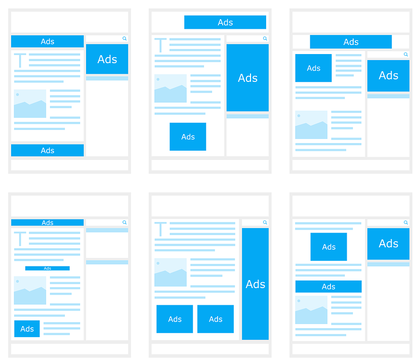
When you set out to design and develop a website, the first thing you do is plan the layout. Most websites either use one or two columns or rows for the content, with one row on top for the menu, search box, login and other relevant information. The footer row holds the copyright notice, policy, terms and conditions as well as links to pages that you might find useful.
The plan above looks good on paper however it can create problems for the web developer. The main issue is that the columns and rows don’t always sit right on various devices. You could end up with one column being too small, another too big, or one row above or below. You need to write tons of code just to make the layout look good.
Short History on Layouts before CSS Grids
When people started getting serious about creating websites, how to spread the content around the web page without it looking like a mess was a big issue. Most people started using the <table> tag to solve the layout problem. Until <div> was introduced.
Div is nothing more than an empty tag that allows you to create individual spaces. Div with floats, absolute position or inline-blocks have been the norm for many years in creating layouts. The alignment issue however wasn’t fully addressed, and you had to do a lot of experimentation and write lines and lines of code just to fix this one problem.
Flexbox however provides a better solution. In fact you can use Flexbox for tabular data vs. the table tag. However even though it performs brilliantly and solves alignment issues, it has one major drawback. It is one-dimensional. This means, you need to code your columns and rows separately, which can cause problems, especially if your layout is a bit unorthodox.
Why Use CSS Grids
CSS grids has been doing the rounds for a couple of years. However implementation has been slow, mostly because not all the browsers that came before had support for CSS Grids. This has changed lately with almost all the browsers, minus IE10 and IE11, understand CSS grids without any problems.
Advantages to using CSS grids in your web development projects are:
- It is responsive out of the box. You don’t have to add more code to make the CSS mobile ready.
- It works as a 2-dimensional platform. This means both rows and columns are simultaneously adjusted according to the screen size.
- You don’t need a framework like Bootstrap for implementation.
- You can also create dynamic, asymmetrical layouts without any problems.
- Doesn’t bloat the file with unnecessary code.
- Works on Edge, Chrome, Firefox, Opera and Safari.
- Simple to understand and use.
- Partners well with Flexbox
And just like Flexbox and CSS Grids, Aspiration Hosting’s Partner Program is ideal for web developers. The latest WordPress hosting plans accommodate every pocket. Cloud hosting plans start with just $2.99.
So now there really is no excuse to start developing your portfolio website.
- 15% lifetime commission
- Custom link
- Easy Sign Up
Check out the Partner Program for more information.

The Basic CSS Grids Lingo
Grid container
This is your blank canvas on which you design your grid like layout. The grid code can be thought of as a declaration to the browser that now a grid starts.
There are two grid containers you can use:
display: grid;

or

display: inline-grid;
Grid cell
The individual cells in the grid forms the grid cell. You can manipulate a grid cell using colors, content, images and videos.
Grid area
Useful shorthand for grid column start and end as well as grid row start and end. You can merge grid cells to create designated areas. The only condition for grid areas is that they can only be rectangular. You can’t merge different shapes to form, for example an L-shape area etc.
For example:
grid-area: 1 / 2 / 3 / 2;
Where:

"1" is grid-row-start

"2" is grid-column-start

"3" is grid-row-end

"2" is grid-row-end
Grid tracks
When you create a grid, you are basically drawing a line vertically and horizontally that creates squares or rectangles on the blank canvas. The lines that make the rows and columns are the grid tracks.
Grid template
A very handy shortcut in CSS Grids is the grid template. You can use it to define your grid columns, rows and areas.
For example:
grid-template: 100px 1fr / auto 1fr;
Where:

"100px 1fr" refers to grid-template-row

"auto 1fr" refers to grid-template-column
Grid column
You can use this nifty shorthand to set the start and end of the column grid. The <span> tag is especially useful when you need to manipulate more than one grid cell.
Grid template column
One of the most useful things that CSS Grids does is allow you to name the grids using the grid template column. This also makes it super easy to edit the code when necessary.
For example:x
grid-template-column: [main-content] 1fr;
Grid row
The shorthand works exactly like it does for the grid column. You just need to specify the starting location and ending location and also how many grid cells to span.
Grid template row
This also functions just like the grid template column. And you can also use names for the grid cells for convenience.
For example:
grid-template-row: [menu-bar] 100px;
Grid column start or Grid row start
You can set from which grid cell, your grid should start from, like if you give a value of 2, the grid starts from the second grid cell, either horizontally or vertically to create the rows or columns.
For example:
grid-column-start:3; grid-row-start: 3;
Grid column end or Grid row end
This one allows you to specify where the grid ends. You can create some great effects using both the start and end grid codes.
For example:
grid-column-end:3; grid-row-end: 3;
Grid gap
Sometimes you need to manage white space for a more visually appealing layout. Grid gaps helps to create spaces between grid cells. You can also think of this more like a method of creating individual blocks.
Fr unit
CSS Grids introduces a new measurement unit. The “fr” unit represents a fraction. It is good practice to use “fr” as a measurement unit alongside “em” for web development projects. The advantage of the “fr” unit is that even a fraction of the available white space can be utilized.

Additional CSS Grids Learning Resources
- Grid by Example
- Learn CSS Grid
- CSS Grids Tutorial
- Cheat sheet for CSS Grids
- CSS Grids Layout
- Grid Garden Game
As a final note:
CSS Grids is easy to learn and adopt. It also makes web development a joy. You no longer are frustrated by the different screen sizes and absolute positioning. The layouts work everywhere just as you wanted them to look.
However you do need to remember that not all browsers are compatible with CSS Grids. For this, you have to code some fall backs that catches any browser issues, but instead of breaking, displays a functioning layout without grids.
If you want to learn about fall backs and how to code for incompatible browsers, check out grid fall backs article on Grid by Example.